Editing a page
Editing a web page is much like editing email content but the editor is slightly different since there are more possibilites for a web page.
Note that the Carma default page template corresponds to Template configurations. This means that account administrators manage default content (header and footer content) and styling of the template from account settings.
Layout
A page template is based on predifined content blocks with different layouts; fullwidth, two or three columns, two columns where the left one is wider, and many more.
Content blocks are found in the template inspector to the right (click the + icon). Drag and drop the content block you prefer to your layout area and start editing text and images.
All blocks includes elements which is the actual content, there are i.e. text, image and link/button elements. 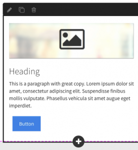 You can add more elements within a block by hovering over the block and click on the plus that appears on the block frame. Then click on the element type you want to add. Move it up or down by clicking the move up/down buttons in the inspector.
You can also delete an element from a block by clicking on it and then click on Delete in the inspector.
When hovering a block a frame will appear and on that frame you have the option to edit the block settings, copy the block and delete the block.
You can easily style your page with one of the built in stylesheets. To do so, click on any element in your layout and then click on the text body at the bottom of the inspector. Look at the top of the inspector where you now see a bunch of stylesheets to choose between.
By hovering a block and click on edit you can tick a check box in the inspector to make your block stretch to full page width.
Text
There are predefined text classes to choose between. 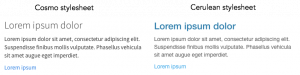 Click on the text element and choose the text class in the inspector. Depending on the stylesheet the text classes will look different.
You can also manually align and style your text in the inspector.
To link a text element just mark the text and go to the inspector and tick “link selected text” and point out the destination, if it’s i.e. another page in Carma or a URL to your website.
Image
To change an image, simply click on the image and you’ll get a dotted line around it. Go to the inspector and click Change image. You can change images by either uploading new images from your computer, Instagram, Facebook, Flickr, Gmail etc.
When the image is uploaded you can edit the image on Edit.
Link/Button
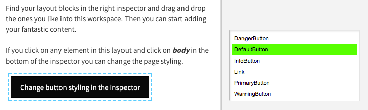 The link/button element can be styled if you click on the element and choose class in the inspector.
The link/button appearence is predefined according to the page body stylesheet.
And hey – you can of course add personalization and page content segments if you’re linking to your Microsite from any of the Carma channels!
Videos and iframed content
In Carma default templates you can add videos and iframed content, these are found in the Inspector (add content), under the block types. The elements are YouTube video, Iframe and Video.
Note that you can also add these elements within a block column by hovering the block and click the + button.
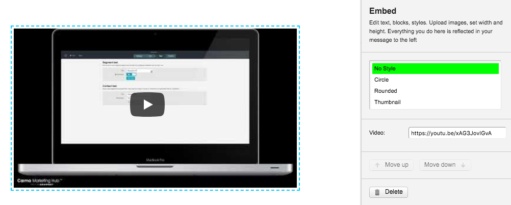
YouTube video
By using the YouTube element you can just paste a YouTube video URL (i.e. https://youtu.be/xAG3JovIGvA) or the unique video ID (i.e. xAG3JovIGvA) in the video input of the inspector.
Note that this element is only for YouTube videos.
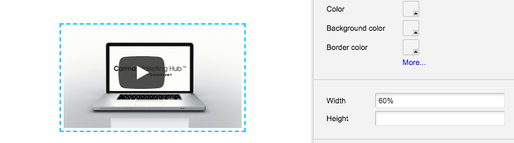
You can resize the video (inspector > width and/or height) but to make sure your video renders properly in different devices you should use procentage scale (and not pixels):
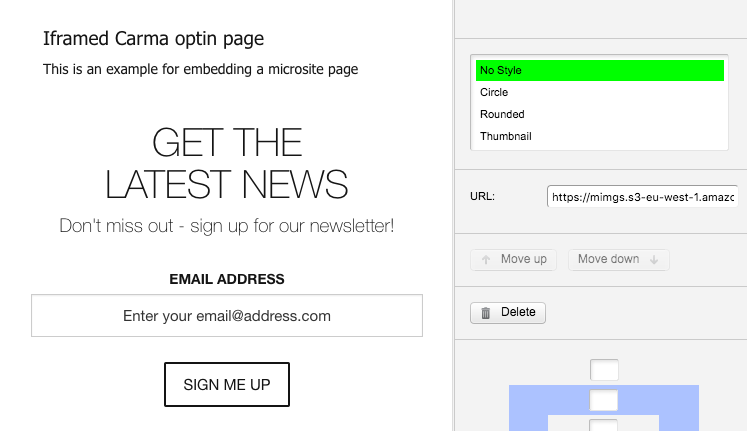
Iframed content
If you want to include iframe supported content from some other web page or source you can easily add the Iframe element and paste the URL to your content.
Heads up though, iframes can be a lot of fun but demands a given height (pixels) and doesn’t always meet the responsive demands for different devices.
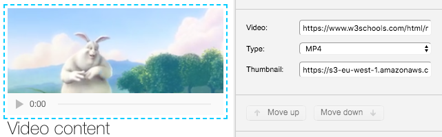
Video
The Video element enables you to add a video hosted i.e. your web site. Just paste the URL in the inspector and provide the format of your video in the dropdown.
If you have prepared a thumbnail you can add this in the thumbnail input.
You can resize the video (inspector > width and/or height) but to make sure your video renders properly in different devices you should use procentage scale (and not pixels).
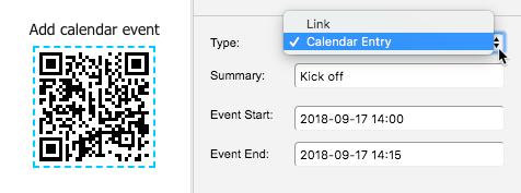
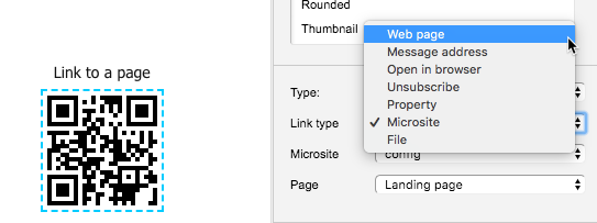
QR codes
QR codes can be very useful when sending Print where you want to lead the recipients to the web. But of course, they can be scanned on your computer aswell.
There are two types of codes, Link and Calendar entry. Choose the type of your link in the inspector.
Calendar entry will request to add an event to the calendar when scanned. In the inspector you add the Summary (name of your event) and when your event starts and end.
If you select Link > Web page and enter the URL to your page your page will open when scanned.
Forms
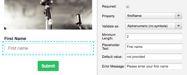
On pages you can add a form with different form elements. Forms will save data on the contact card for each participant and can help you create profile and preference pages.
When you’ve added an element you must select a connected attribute (property). All your attributes are found in the Property dropdown menu in the inspector.
The different form elements are found as one column blocks in the inspector under the + icon (Add content) or you can add them to a block column by clicking on the + icon appearing on the block frame when hovering.
If you want a form element to be mandatory for the participants you just tick the Required checkbox.
Set a default value if you want a specific value to be saved in the selected attribute when a particapant doesn’t provide you with an answer.
You can also write your own error message that will appear if the form is submitted without any reply in required form elements.
Form elements
Text
Text element allows you to write text in a field (this could be email address, first name, last name etc).
When adding this element you’ll see a text row above the input field called Label. This should be the title of your input field to show the participant what you ask for.
You may consider using text validation when using text form elements, this will help you to get the data you actually want. The validation types are:
- Email address
- Number
- Alphanumeric (no symbols)
- Pattern
You can also set a minimum character length. Just enter the minimum number in Minimum length.
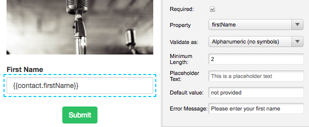
In the actual input field you can add a placeholder text or if the participant enters the page from a Carma message you can prefill the input field with contact data.
- Placeholder text – In the inspector, write a placeholder text that guides the participant (this text will be light gray in the input field).
- Prefilled text – Add the handlebar of the connected attibute. Note that the handlebar should be written in the input field.
Checkbox
Checkboxes allows a participant to select one or more options. It could be “Yes, I’ve read the terms and conditions” or “I want to receive information about Rock but not Hip hop”.
Each checkbox should be connected to a specific Carma attribute.
Note that if you add a Required checkbox, the checkbox must be ticked by the participant.
The text (visible next to the checkbox) and the value for your checkbox can be edited under Choices. The value is saved in the selected attribute for each participant that ticks the checkbox.
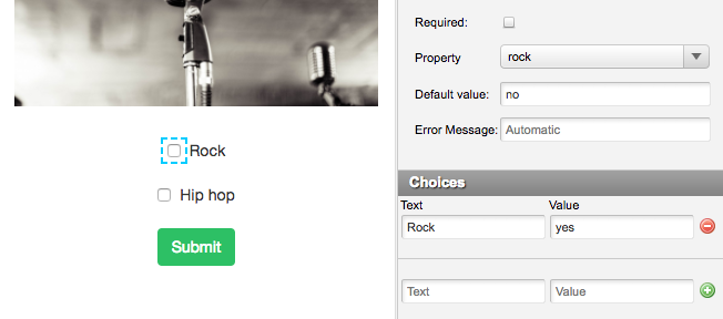
If a participant entering the form page already have a matching choice value to the one you’ve added the checkbox will be ticked.
If you add a second checkbox option, your checkbox will transform to radiobuttons.
Radiobutton
Radiobutton allows a participant to select only one out of at least two options. No matter the number of options a radiobutton element is connected to one Carma attribute.
The text (visible next to the radiobutton) and the value for your radiobutton can be edited under Choices. The value is saved in the selected attribute for each participant that chooses one of the options.
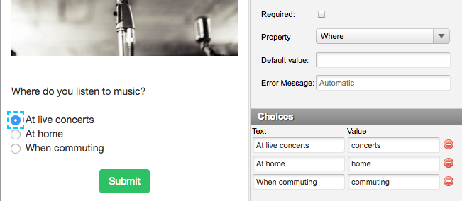
If you delete your options so that only one is left, your radiobutton will transform to a checkbox.
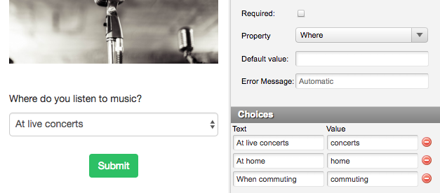
Select
Select will provide you with a dropdown menu and, like radiobuttons, will allow you to select one out of at least two options. No matter the number of options a select element is connected to one Carma attribute.
The text (in the dropdown) and the value for your options can be edited under Choices. The value is saved in the selected attribute for each participant that chooses one of the options.