
Why does my email look different in Outlook/Gmail/iPhone?
We would love for all of your emails to look equally great everywhere – but the world of email really is something else. Unlike web design, many things we now take for granted is not supported by the most popular email clients or devices – such as certain fonts or in-line (CSS* in short). Thus, you might benefit from considering a few things in your email design.
While this text focus on email clients and their known quirks, there is a whole process your poor mail goes through before reaching the inbox that might impact the result too. To make things even more confusing, there are severe differences between desktop clients, web clients and apps – including within the same brand of client.
The best ways to combat rendering anxiety is:
- Test, test and then test your mail
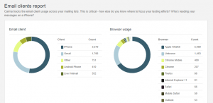
- Check your statistics of devices and clients in your reports:
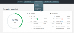
In the report, under Deliverability – click Email clients report. Here you will find the most used devices and email clients by your recipients, and these are the ones you should focus on. Don’t spend hours on adapting your mail to Lotus Notes, if 0.0001% of your recipients are using it.
- Follow these guidelines below to minimize unfortunate renderings
Outlook
Generally known as the buzz-kill of email, Outlook does not support CSS, custom fonts, background images – the list goes on. This includes the browser versions of Outlook, i. e. Hotmail, Outlook.com and Office 365. Surprisingly, the app Outlook is a lot better. Listed below are some of the known issues emails encounter with Outlook:
White horizontal lines – Usually on dark backgrounds. The only real remedy is to avoid dark background colors.
Background image or color missing – Yup. That is just Outlook doing it’s thing.
Rounded buttons that turn up square? Just Outlook.
“Breaking” mails (parts of the mail sticking out) – This might be due to wide content, check image sizes, do not use percentages!, and margins/paddings. OR it’s just Outlook 2013 120 DPI which zooms in. Responsive templates might have issues reacting to browser and client zooms, and there is no way of getting around that except a solid, fool-proof design.
No images – Most often, this is because the recipient has disabled automatically downloaded images and after enabling manual download, the network does not allow a re-download. There is no code to fix this.
Thick lines – Does your mail looks like its invaded by heavy renegade dividers? That would be a line height issue which is sometimes due to a divider, sometimes not. If you are using dividers, try adding a border to full width blocks instead. If you are not using dividers, try removing all blocks and see if there is residue from an earlier campaign.
Outlook crashing/rendering only parts of a mail – This is probably due to how heavy your mail is, or if any dynamic content is taking too long to respond. Depending on your template needs, you might want to contact our production team to optimize your template.
Gmail
We love Google’s take on email – but Gmail doesn’t seem to love email design 🙁
Officially, the limit for a mail is 102kb (or it might be ”cut”) but this seems random at times and if you’re mailing a lot of tests to yourself – get ready to see a little box with three dots in it instead.
Gmail is slowly supporting more in-line, but we’re not there yet and all gmail clients; Gmail, Inbox by Gmail, G Suite and the app share some issues.
White space to the right – Especially visible in Androids, but this depends on device and OS. This can be slightly helped by full width designs without menus and three column blocks.
White space on both sides – Yeah, that is just Gmail. No matter how wide your email is, they are going to be there. Obviously, these will be less visible if your mail is white.
“Not responsive” behavior – Gmail is very sensitive to zooms in the browser and/or window size, but does not allow for percentage zooms. So, some blocks in a smaller window/zoom will render “stuck” betwixt and between a small screen size and a large one. The best way to prevent this is to have full width blocks and elements.
Android
Apparently, androids do not dream of green email. If they do, it is filled with white lines. Some Androids (depending on client also) supports CSS, but generally you can expect:
Lack of background images and color
Different rendering than iPhone (less fullwidth)
No custom fonts
White lines in colored blocks – this could be an indication of something being too wide in your mail, so check that all blocks and elements are of correct width. Some native clients automatically zoom in, this might also render the tables visible:
Apple/iPhone native
Ever wondered why the mails from Apple always look great? Probably because you’re reading them in an Apple client. If most of your recipients are Apple-users, congratulations! The only thing that might throw a damper on this party is the sacrifices you have to make for the other clients/devices. And the surprise links:
Blue links – Apple tend to link phone numbers and dates, and decide for you how clicked/linked/hovered links should also be blue (no matter what link color you have chosen). There are ways around this, but they might change all the link colors in other clients.
All clients have their own quirks and challenges, but remember that sending emails are about communicating with your recipients – make sure your email is readable and enjoyable first. And, you know, have a look through our guide to design. You can also read more about what affects email rendering, here.
*CSS support includes cool things like:
- Custom fonts, i. e. ANY other fonts than these web safe ones.
- Hide/show in mobile
- ”Responsiveness” in percentages
- ”Hover” links (and other cool link functions)
- Animations
- Possibilities to over-ride zooms or other inconvenient functions in the email client