
Navigating the editor
To be able to edit your email you need to know the basics of the email editor.
Please note that your editor may differ from the examples shown below.
Some useful lingo information before we start:
Element – an element is a type of content. It could for example be an image, a heading, a text paragraph or a button. When clicking on i.e. an paragraph, a blue dotted frame will appear to show what’s included in the current element.
Block – a block is a layout structure of different elements. It could for example be a fullwitdh layout including an image element, a heading element, a text paragraph element or a button element. When hovering any element in your layout, you’ll see a black frame surrounding one or more elements, that’s your block.
The inspector – when you want to edit the styling of your content or your block structure, you’ll do this in the inspector. The inspector is the area to your right and depending on if your editing a block or and element the inspector will provide the available options for your selection.
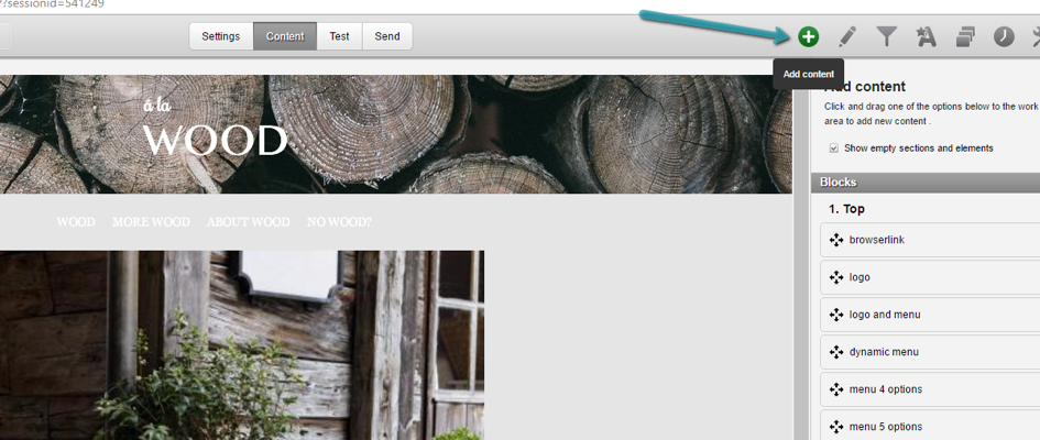
All the available blocks are visible in the menu to the right, in “Content view”. You can return to this menu at any time by pressing the green plus-button.
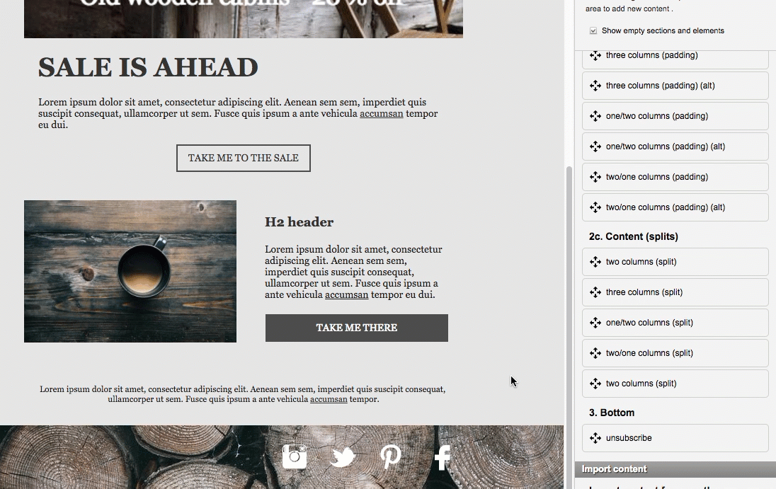
Simply drag and drop blocks from the right into your lay-out.
In the lay-out you can remove, copy or inspect the different blocks by hovering over the block and clicking the trash bin, copies or magnifying glass icons respectively.
By inspecting a block you can also choose button alignment and background color (among other things) in the menu to the right.
Hover over your block to see the arrows which moves the block up or down (within its section) or add content to your block – just press the green plus button.
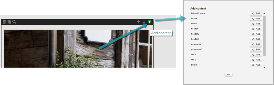
Click on the add button to add block elements (content) to your lay-out.
Different blocks will have different elements available. Blocks with more than one column will also divide these into left, right and center content.
Within the block you add and delete elements, or move them up and them. Just select the element and choose action in the menu to the right:
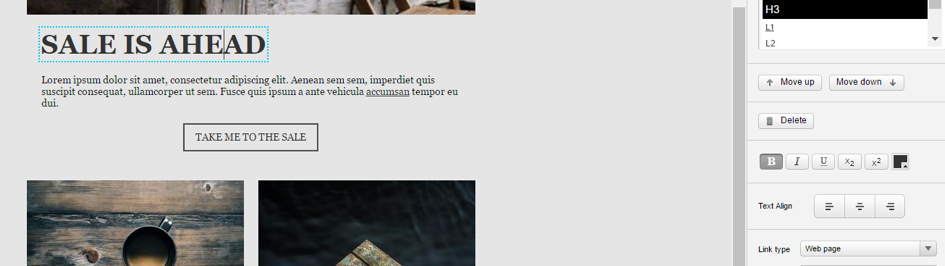
Here you can also choose to link elements and style different text elements. Remember that changes made will apply to the whole text element.
Change an image by selecting the image or image placeholder. Upload from your computer or an URL in the menu to the right:
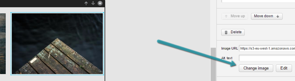
Use the same method to change all image elements, like logos or social media icons.
About images:
You will most likely have different images available in different blocks. Depending on your template, you will find variations of “full width image” and “fixed width image” – these are pretty self-explanatory. You should not get into the habit of trying to change the width of the responsive images in your template – they are this size for a reason, however unresponsive images like logos and icons are fine to mess around with (just keep them under 320px!). Our recommendation is using high-resolution .png-files, original images should be about the same width as the image placeholder, whereas unresponsive images may be a bit larger. We do not recommend setting a height on your images in Carma, or using percentages to manipulate size. This will cause bad rendering in many email clients and devices.
Should you want to change the complete background of your template (and not just the blocks), you may do so by selecting any element in the template. In the furthest down right corner, you’ll find breadcrumbs:
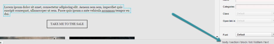
Select “body” in order to change background color or image.
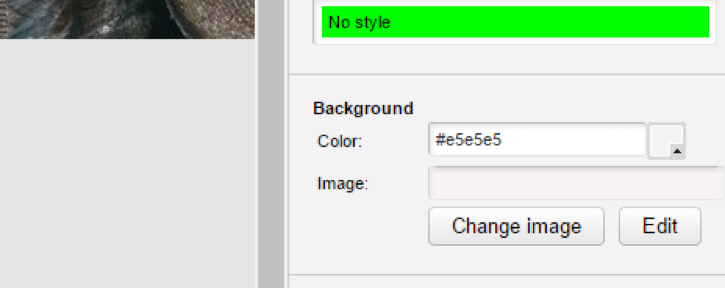
Use background images with caution, you will need a form-fitted pattern in order to avoid loops and be aware of that certain email clients do not show background images at all.
Don’t hesitate to contact us if you have further enquiries about templates! When you do, please refer to a draft and/or the complete template name.